


January 12 2022 - 7:27am
A long list of reasons why the South African experience of Omicron would not necessarily be replicated in the UK was offered by high-status science commentators throughout December. The British population is older, less immune, the South African data is unreliable, etcetera. The claim was that, even though the wave had been much milder than Delta in a South African context, it could still be much worse in Europe and still overwhelm British hospitals.
Professor Neil Ferguson’s Imperial College team even produced a study, late in December, that managed to conclude there was ‘no evidence’ that Omicron was milder than Delta — based on the same theory that the differences in outcome could be entirely down to immunity rather than intrinsic to the virus. Patrick Vallance and Chris Whitty, the UK’s medical and scientific leaders, were persuaded and lobbied the Government for additional restrictions before Christmas based on the same apparent uncertainty.
And yet, once again, it turns out that the obvious was true after all.
Now that the cases have peaked in London (since 23rd December in fact) and the hospital variables are in decline, it is possible to compare peak levels between London and Gauteng province in South Africa, where the Omicron wave began. There are very real differences between the two cities: Gauteng has relatively high prior infection levels and low vaccination rates, while London has lower prior infection rates and high vaccination rates. Gauteng has a younger population compared to London. Despite all this, the Case Fatality Rate (CFR) dropped 5-7-fold in both areas between Delta and Omicron.
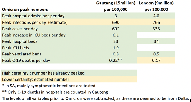
Peak hospital admissions per day were slightly higher in London at 4.6/100k compared to 3/100k in Gauteng. Peak hospital beds were slightly higher in London at 34 beds/100k compared to 23 beds/100k in Gauteng. Due to poor quality public hospitals in Gauteng, many people in disadvantaged communities only go to hospital as a last resort, which partly explains the lower hospital numbers in Gauteng.
Infection levels were estimated to be similar in both metro areas. London does dramatically more testing than Gauteng, which explains the significantly higher case levels.
![]()
The peak in ventilated beds was lower in London at 0.5 beds/100k compared to 0.8 beds/100k in Gauteng. Peak Omicron deaths were also lower in London at 0.17/100k per day compared to 0.22/100k per day in Gauteng.
But across all of these measures, it is remarkable how small these differences are for two such different places on opposite sides of the world.
Just before 18 December 2021, when England was considering increasing restrictions from Plan B, SAGE warned that should the UK only persist with plan B, it could see 600-6,000 deaths per day. This works out at 0.9-9.0 deaths/100k. London appears to have peaked at a level of 0.17 deaths/100k which is 5 times lower than the lower bound and 50 times lower than the upper bound.
The question remains how SAGE managed to get it so wrong? It would seem there are three main reasons: 1) Using a similar intrinsic virulence in Omicron compared to Delta, despite evidence to the contrary 2) Assuming a significant reduction in vaccine effectiveness against severe disease with Omicron, which didn’t transpire 3) Overestimating the attack rate during the Omicron wave itself.
In actuality, the early data from South Africa turned out to be a better guide than the most sophisticated models produced for the British Government.