


12 December 2025 - 1:00pm
Enthusiasts for model railways can take the hobby very seriously, devoting substantial time and attention to getting period detail absolutely right, up to and including the livery of locomotives and rolling stock. Heated debates can arise over the relative merits of the interwar colour schemes, the post-nationalisation redecoration, or — for the real connoisseur — the traditional patterns from the pre-First World War “Golden Age”.
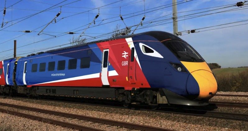
Now such arguments have broken out into the real world, with the announcement of the logo and branding for Great British Railways. GBR will, eventually, run all the railway franchises in the country as part of the Government’s renationalisation programme. It’s easy to treat such matters as mere fluff, the concern of pedants and advertising men, but branding is far from trivial. The appearance of GBR trains will become part of the country’s image, not only among British people but visitors and tourists. It reveals something about what kind of place Britain is, and will form part of the backdrop to many people’s day-to-day existence.
This is why it is a shame that the unveiled designs are so unremarkable. Not terrible, not hopeless: just ordinary and unambitious. The branding will reportedly be the same across all forms of service, which is a missed opportunity. In the old days, there was fun to be had — and considerable utility — in being able to distinguish at a glance between intercity, commuter and regional traffic.
I don’t claim any expertise in graphic design, but I suspect that the GBR pattern may come to look dated quite quickly. It relies heavily on the “big blocks of colour” style that has become widespread in corporate aesthetics over the last couple of decades. It evokes memories of the 2012 Olympics, and shares a kind of childish sensibility with the faceless, shapeless, ethnically ambiguous cartoon characters which now crop up everywhere in both private and public communications. This type of imaging will likely fade in popularity in the not too distant future, a victim of changing fashions.
The return to the old British Rail double arrow logo also feels unambitious. I enjoy a bit of retro-modernism as much as the next person, and there is a certain nostalgic appeal in seeing it on the side of trains again after the privatisations of the Nineties. But it is 80 years now since the original post-Second World War nationalisation, and 60 years since the double arrow made its first appearance under Harold Wilson. The formation of GBR would have been a fine opportunity to come up with something new, something more forward-looking and innovative, especially as our railways are falling behind technologically in comparison to other developed nations. This Labour government doubtless relishes the implicit association with the glory days of the last century, but we are in another world now.
