


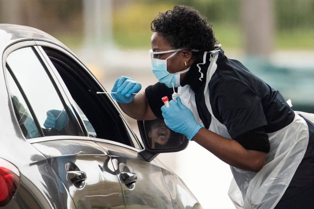
The more testing we do, the more accurate the modelling. Credit: Dan Kitwood/Getty


The national conversation is dominated by coronavirus statistical models at the moment. The Imperial College model, the Oxford model, the other Imperial model.
I want to talk about the models, and what they tell us, because the outputs of these models drive the government’s response — and thousands of lives could turn on them. It’s important, therefore, that we understand them, and why the numbers they give us are so different. These figures led Peter Hitchens, the Mail on Sunday columnist, to complain that the number of deaths has jumped around from 500,000 to 20,000, to 5,000. I can see why people are confused, if they just think “the models” are taking the same numbers and spitting out these weirdly different results.
But first, I want to talk about something much simpler. It’s the question that many of us, I’d say, most want to know, when we’re anxiously thinking about Covid-19 and ourselves and our loved ones. That is: if someone gets the disease, how likely are they to die?
The splendid Our World in Data (OWID) — who, full disclosure, I’ve been doing some editing for during this crisis — have been working on answering that question. So has Oxford’s equally splendid Centre for Evidence-Based Medicine (CEBM).
It is probably the most basic question you can ask about a disease, and yet it’s bloody hard to answer. It changes between places and over time, and between different groups; it depends on a variety of hard-to-measure factors, and the answer you get itself directly affects our understanding of several other numbers, all of which are vital to any model of the disease.
So. You may have heard a term being used: the “case fatality rate”, or CFR. That is the number of deaths divided by the number of confirmed cases. When journalists talk about the “death rate”, that’s often what they are referring to. If a country has 10,000 confirmed cases and 100 deaths, then the CFR in that country is (100/10,000), or 1%.
That is not what we are looking for, and it is probably not even very close to what we are looking for.
Instead what we want is the “infection fatality rate”, or IFR. That is the number of deaths divided by the number of people who actually have the disease. The number of people who have tested positive for the disease is probably only a fraction of the total number who had it, because only a fraction of the population has actually been tested.
Obviously, the IFR is much harder to determine accurately. The only people getting tested will be the people who are most ill, so your IFR is probably much lower than your CFR, because your denominator — the number you’re dividing by — is probably much bigger.
So if your country has tested absolutely everyone and found all cases of the disease, then your IFR is the same as your CFR, or 1%. But if it has only found 10% of the people with the disease, then your 10,000 confirmed cases are just the tip of a 100,000-person iceberg. With those 100 deaths, your IFR would be (100/100,000) or 0.1%.
Sadly, all we know is the CFR, and it changes hugely from country to country. Professor Jason Oke, a statistician at Oxford University and one of the people behind the CEBM analysis, points out that the CFR in Italy is many times higher than that in Germany; 11% of confirmed cases have died in the former, compared to 0.79% in the latter. “That can’t be down to healthcare differences,” he says: “Italy isn’t a third-world country. And it can’t be demographics — Italy has an old population [and older people are at greater risk], but Germany isn’t far behind it.”
The likely explanation is that the difference is down to testing. Italy has largely tested people with symptoms, in hospitals; Germany has tested many thousands of people who have no symptoms. That probably helps prevent some deaths, but the most direct impact will be that it hugely increases the denominator; again, if you’re dividing your 100 deaths by 100,000 instead of 10,000, your death rate will be much smaller. Germany’s will be closer to (but not the same as) the IFR, the number we really want.
So, a country’s CFR will vary depending on how many tests it’s done, because that changes the denominator. But at least the numerator — the number being divided — is probably pretty straightforward, right? A death is a death.
Sadly, that’s not the case either. Dr Hannah Ritchie, one of the data scientists at OWID, points out that the death statistics are complex too, for two reasons. One is prosaic: a lot of people who have the disease and will die of it have not yet died. “The period from onset to death is about a month,” she says. So your simple “divide the numerator by the denominator” rule — the number of deaths by the number of patients — doesn’t work, because your number of deaths is a product of how many people had the disease a month ago, not how many people have it now.
That’s bad enough. But there’s a more profound problem, which is that deaths themselves can be recorded very differently in different places. Professor Sir David Spiegelhalter, a statistician at the University of Cambridge, says that the UK simply counts people who have tested positive and then died. But in some other countries, people are recorded as having died of Covid-19 if they had the symptoms, even if they weren’t tested (“suspected” as opposed to “confirmed”); in others, people outside hospitals are not tested and so are not recorded.
“Even the number of deaths is not a perfect statistic at all,” Spiegelhalter says. El Pais did an interesting look at some of the international differences here; Britain’s Office for National Statistics explains why its numbers look different from the official Government ones here.
To some extent it doesn’t matter, says Spiegelhalter: as long as each individual country maintains the same regime, ”the number of deaths is still a good monitor for the shape of the epidemic”.
But it’s not clear that they are fixed; countries may have good reasons to change the way they collect data as circumstances change, but it apparently happens often enough that the World Health Organisation feels that they have to ask countries to notify them when they do it. Famously, China did so earlier in the epidemic, but others do too: in complying with the WHO’s request, Australia has noted that it has changed its definition of a Covid-19 “case” (and therefore a Covid-19 “death”) at least 12 times since 23 January.
So, in essence, to work out the IFR — the number we want — we need to know two other factors: the number of people infected with Covid-19, and the number of people who died of it; the denominator, and the numerator. And, sadly, both numbers are uncertain.
How much does any of this matter? Well: now, I’m going to try and build my very own, rather stupid model. I’m not going to try to predict the future; I’m just going to try to use some very simple numbers to “predict” the number of cases there are in the UK right now.
First, the number of reported Covid-19 deaths in the UK is 1,408. Second, the lag between infection and death is about three or four weeks; let’s say three. Third, the number of (confirmed) cases in the UK has been doubling about every three to five days; let’s say five (and assume it’s staying constant; forget social isolation for now).
With those numbers, we can plug in our guess at the IFR (the infection fatality rate, remember: the real number we want to know, the “if I get it, how likely am I to die” number) and use it to work out roughly how many cases we’d expect now.
So what number should we use as our IFR? I’m going to use three: one from Imperial College London’s MRC team, the one behind the famous model; and two from CEBM. Imperial’s latest work assumes an IFR of 1%; CEBM estimates it to be between 0.1% and 0.26%.
If we take the Imperial 1%, then that means that we can multiply the 1,408 deaths now by 100 to get the number of people who’d had the disease three weeks ago, because we think about one in 100 of them died. So about 140,000 people.
Then we can take our doubling time — we said five days — to get how many cases we’d see now. In three weeks, 21 days, you’d see four doublings; two to the power four is 16. So 16 times 140,000, which is 2,240,000. We could imagine that we’ve probably got about two million cases now.
But let’s use the CEBM numbers. First the highest one, 0.26%. If we take that, we can multiply the 1,408 deaths by 400, instead of 100, to give us the number of infections three weeks ago. That is 560,000. Then we can multiply that by 16 to give us an estimate of how many there are now: about 9,000,000.
And how about if we use their lowest estimate, 0.1%? Same routine: 1,408 multiplied by 1,000, multiplied by 16: more than 20,000,000.
So by changing a single number, the IFR, to one of three plausible values, in a very simple model, we get outputs that range from “3% of people have already had it” to “30% of people have already had it”. And that’s before we start messing around with the other assumptions; is doubling time three days, not five? Is infection to death four weeks, not three? Is “1,408 deaths” even correct?
I want to reiterate: this is a very simple, stupid model, put together by a journalist, not an epidemiologist. The actual models will be far more complex, and will take into account other things — the number of cases in hospital and so on — to try to ground them in objective fact. Don’t mistake this for some plausible estimate of infection numbers. And there are loads of other things to worry about: people suffering long-term health consequences, even if they live; people dying of other things because the healthcare system is overwhelmed.
But the problem that I’m illustrating is real. Small, plausible adjustments to your inputs make your model spit out very different things. The assumptions you make are vital. We haven’t even started to think about other crucial things — for instance, government interventions, and how effective they are.
“The different scenarios — isolation, closing schools, quarantines — they come with massive assumptions about how adherent people are,” says Ritchie. “You get massively varying outputs, depending on what you put in.” Plus, of course, it’s all circular: your model influences how you respond; your response changes what numbers get put back into the model.
What you need is better numbers, to plug into the models. And that’s what people are trying to get. The CEBM paper uses, among other things, numbers from Iceland, which — being tiny — managed to test a huge proportion of its population, nearly 3%. It found 963 cases and just two deaths; an CFR of 0.2%, from which the CEBM extrapolates an IFR of 0.05%. But that’s likely an underestimate, because quarantining has protected the elderly, the most at-risk group. Others have done something similar with passengers on the cruise ship Diamond Princess, finding a CFR of around 1% — likely an overestimate, since the passengers tended to be older.
Another way has been to screen small groups who are in quarantine, such as the Diamond Princess passengers or passengers on aircraft, to see how many people 1) test positive and 2) show symptoms. If you know how many people have the disease but are asymptomatic, then you can extrapolate to the wider population — if you’re testing all the people who are symptomatic, and you know that 50% of infected people don’t show symptoms, and you find 20,000 cases, you can estimate that the real number is more like 40,000.
But there’s a problem here, too, which is that “asymptomatic” is not a simple thing, according to George Davey Smith, an epidemiologist at the University of Bristol. If you’re sitting in quarantine and you cough, you might be recorded as symptomatic; but out in the real world, you’re not going to take yourself to hospital for a gentle cough, so you still won’t get tested.
Instead of there being a neat “symptomatic/asymptomatic” division, you have a third group: people with some symptoms but who think it’s just a cold in the chest. (As I write, I’m coughing a little; but I don’t think that’s Covid-19, I think it’s just because I went for a run this morning and the cold irritated my lungs. But I’d probably be recorded as “symptomatic” if I were in quarantine and being screened.)
And yet another way is to look at how many people die every year, and how many people are dying now, and seeing whether more people are dying than usual. That’s how we attribute deaths to flu each year, says Spiegelhalter; the European Monitoring of Excess Mortality group (EuroMOMO) uses this data to say that in an average year in the UK, 17,000 deaths are “associated” with influenza. But so far there is no excess death at all, except in Italy: the EuroMOMO charts are all around the seasonal average. That will likely change, but we forget that in a population of millions, you’d expect thousands of deaths every day anyway: even the Covid-19 pandemic is still being lost in the noise.
In the end, we need testing. And not just the sort of testing we have now — PCR testing, which shows who has the virus right now; we need serological testing, which shows who has had it in the past. That will come along relatively soon, and hopefully can be quite quickly used to test randomly selected people, like an opinion poll sampling a population; then we can see how many people have had it, and from there work out the IFR. But for the moment we don’t have that.
I wanted to write this to give an impression of how appallingly difficult the modeller’s job is. I write, sometimes, pieces about statistics — I suggested that claims about the loneliness epidemic, teen suicides, and the media’s influence on Brexit were overstated, for instance. They involved very basic maths, done for very low stakes: if I messed up, if I failed to carry a 2 or whatever, I would look very stupid and would be very embarrassed, but no one would die.
Whereas, if the Imperial College modellers get it wrong, with their far more complex maths and their far more uncertain inputs, they could sway government policy enormously. Whether we lock down society or carry on as normal depends heavily on the outputs of models like these. And it’s not that there’s an easy “better safe than sorry” option; if we crash the economy, it will (eventually) cause real health problems.
A February 2020 review found that 10 years of austerity may have caused the growth in life expectancy to stall, especially among the poorest; I’m sceptical of the “130,000 deaths caused by austerity” stat, but it’s pretty clear that it had a real negative impact. The post-Covid-19 world will almost certainly involve huge austerity to pay for the vast costs incurred during the virus.
Get it wrong one way, and thousands of people die unnecessarily from the virus; get it wrong the other, and you crash our public services and kill people that way. (I’ve only seen one attempt to model the health outcomes of that crash, and I have no way of judging it; for what it’s worth, though, it does say they will be extremely terrible; on the other hand, recessions don’t seem to shorten life expectancy, so who knows.)
So I’m very sympathetic to the modellers. But there are things which would help, and which they can do, but haven’t, so far at least. Ferguson’s team has not released the code his model is based on; he says he is working with software developers to do so, but proponents of open science, like Davey Smith and his colleague Marcus Munafò, say this isn’t happening fast enough.
“These models are so sensitive to their assumptions,” says Munafò. “And they’re black boxes.” The code is 13 years old; it’s vital that other scientists are allowed to look at it, check it for mistakes and stress-test its assumptions. There are other, open-source models available, but the Imperial one is still kept under wraps, and it shouldn’t be.
Because a lot rides on the outputs. If millions have already been infected and the disease is less deadly than we think, then our response should be very different to if millions are still to be infected and tens or hundreds of thousands more will die.
The latest from Ferguson’s team suggests that between 1% and 5% of the UK’s population has already been infected. Oke of CEBM thinks that that could be an underestimate — he thinks that the disease was circulating in China for a month or so before it was announced. “There were early reports of doctors saying they were seeing unusual respiratory symptoms, which were suppressed,” he says. That could have brought it all here much earlier.
When I mentioned the Oxford “study” — in fact a model showing what plausible inputs could produce what we’ve seen, one of which was a very low IFR and huge number of people already infected — he didn’t endorse it, but said “I think a lot of people have underestimated how far this has already spread, and how early.” Davey Smith also thinks that those Imperial figures could well be an underestimate. I have no idea if they’re right or wrong, but whether they are or not matters a great deal.
For the record, to take us back to the beginning, Peter Hitchens had flatly misunderstood what was going on. The 500,000 number was a worst-case scenario if we did nothing; the 20,000 was Ferguson’s team’s estimate of what we’d see now that social-distancing measures and so on are in place.
The 5,000 wasn’t from Ferguson’s team at all but from an electrical engineering group also at Imperial who just eyeballed the death curve on the China graph, fitted the UK numbers so far onto that, and extrapolated from there. “They explicitly say they’re not doing any epidemiological modelling at all,” says Spiegelhalter, “and they retracted it two days later on Twitter,” after it became obvious that it was wrong.
But we shouldn’t be complacent and assume that, just because people are misunderstanding what the modellers are doing, the models must be correct. Everything that comes out of them is the product of what goes in, and all of that is going to be wrong, to some degree. “The key point is that the numbers we have now are not correct,” says Ritchie.
If you look back to previous outbreaks, such as the 2009 swine flu epidemic, the numbers people were using while it was still going on were wildly different from the ones scientists settled on afterward: early estimates in 2009 were between 0.1% and 5.1%; the eventual WHO estimate was just 0.02%, similar to seasonal flu. In a fast-moving situation, it is easy to make large mistakes. (In either direction! I am not suggesting that the Covid-19 situation will necessarily be similarly overstated.)
These models are the best information we have at the moment. But they are hugely uncertain, and likely to be wrong. All we can do is try to get better information for them, and make the best decisions we can under conditions of appalling uncertainty — and be forgiving of the modellers who are desperately trying to make life-changing, history-changing decisions at high speed and with bad data.
