X Close

The European map that explains populist politics

Credit: @That_Garth_Guy

May 4, 2022 - 3:30pm

Populism has expressed itself in many different forms across Europe, but there is one factor that comes close to explaining it at a macro-scale.  

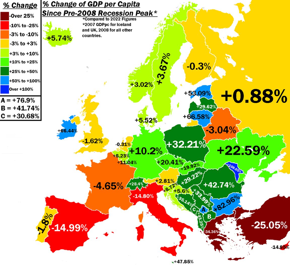
The above map, tweeted out by the economist Daniel Lacalle, shows the change in GDP per head in each country since the pre-2008 recession peak — i.e. before the chaos caused by Global Financial Crisis.

There are various issues with comparing GDP between different countries (not to mention different points in time), but the key point here is the broad geographical pattern.

Looking at Western Europe first, the story is one of stagnation in most of the big economies — with Germany as the main exception. Germany also happens to be a country where populism has had comparatively little impact. The main populist party, the AfD, has been frozen out of national and regional government and its electoral strongholds are limited to the former East Germany. Contrast that to the British experience, where the populist surge took the history-changing form of Brexit. As for France, populist parties of Left and Right now completely dominate the opposition to Emmanuel Macron. 

Turning to Southern Europe, we see that the economies of Spain, Italy and Greece have suffered badly over the last decade. These countries were hammered by the Eurozone crisis and have yet to fully recover. One might expect this to provide fertile ground for a political backlash — and that is exactly what has happened. In Greece, the populist Left has already formed one government (eventually crushed by the might of the European Central Bank). In Italy, the largest party of the populist Right is hitting new highs in support — and its leader, Giorgia Meloni, is in pole position to become the country’s first female Prime Minister. Meanwhile in Spain, the taboos of the post-Franco era are breaking down. The hard Right Vox party is currently on course to gain a share of national power as a coalition partner to the more moderate Partido Popular. 

The economic picture looks very different in the former communist countries of central and Eastern Europe. The likes of Poland and Hungary have grown rapidly — though from a much lower base than the much richer countries of Western Europe. Populism has also taken a different form in the east. Rather than being an expression of protest, it is about parties of government distributing the proceeds of growth to their supporters while asserting national identity against real or imagined external threats.  

To be clear, I’m not arguing that economics is the sole determinant of Europe’s politics. Nevertheless, a comparison of the different parts of the continent does show that money matters. Populism won’t go away until all of Europe is rich, all of Europe is growing and all Europeans feel included.


Peter Franklin is Associate Editor of UnHerd. He was previously a policy advisor and speechwriter on environmental and social issues.

peterfranklin_

Join the discussion


Join like minded readers that support our journalism by becoming a paid subscriber


To join the discussion in the comments, become a paid subscriber.

Join like minded readers that support our journalism, read unlimited articles and enjoy other subscriber-only benefits.

Subscribe
Subscribe
Notify of
guest

8 Comments
Most Voted
Newest Oldest
Inline Feedbacks
View all comments
hayden eastwood
hayden eastwood
1 year ago

I’m confused. The author suggests that stagnating GDPs cause populist movements in Western Europe.
And then he suggests that growing GDPs cause populist movements in Eastern Europe.
How can high and low GDP growth both be simultaneously causal for populism?
Assuming, as he does, that correlation is tantamount to causation, has he considered that it may in fact be the rising banana prices in Venezuela that have driven the observed populism?

Last edited 1 year ago by hayden eastwood
Julian Pellatt
Julian Pellatt
1 year ago

I too am confused! Do populist movement cause changes to GDP or vice versa?

Liam F
Liam F
1 year ago

simplistic nonsense. You could pick any single vector you like and thence prove black is white – Or vice versa. maybe it was the level of youth unemployment in southern Europe that increased populism? or mass migration that proved it didn’t .

Ian Stewart
Ian Stewart
1 year ago

Eh? EU investment largely goes to Eastern European countries. Meanwhile Germany economically screwed the club med countries with an artificially managed currency.
Nothing to do with populism. The sky has always been blue and people die, it ain’t connected.

Adeyanju adebiyi
Adeyanju adebiyi
1 year ago

Populism has nothing to do with GDP growth. To juxtapose the two variables in research will lead to blunder. It’s better the author consider political instability due to changes of political parties in Europe with GDP.

Colin Elliott
Colin Elliott
1 year ago

The author clearly thinks populism is Bad (see last sentence).
But I’m not sure it is, and mainly because I see no pattern to ‘populism’. Surely, Macron’s rise to power looks like populism, seeing as he created a new party, whereas the UK is accused of this crime even though the Conservative party has existed longer than most other parties, indeed, longer than most countries, and although there were loyal Europhiles in the party, there has also long been a Eurosceptic group, and Thatcher was surely one of them.

Last edited 1 year ago by Colin Elliott
AC Harper
AC Harper
1 year ago

This may seem persuasive at first glance but percentage change in GDP is a proxy for a GDP proxy, and GDP is widely recognised to be a poor quality statistic.
We’re not just comparing apples and pears here, we’re comparing changes in the sizes of apples, pears, bananas, and pineapples etc.
A test: Brexit was a fairly significant change in the political map of Europe, how does the UK GDP explain this?

Matt M
Matt M
1 year ago
Reply to  AC Harper

Not even sure it is persuasive at first glance.
How similar have the last 14 years been in the countries whose GDP/person has been flat: yellow countries on the map? Portugal (-1.8%), Britain (-1.62%), Finland (-0.3%), Russia (+0.8%), Austria (+2.81)? Not very similar, I’d say.
Also why did they use 2007 as the baseline for the UK and 2008 for everyone else? Our GDP/person was substantially higher in 2007 than 2008. I wonder whether we would be +ive if they had used the 2008 figures as the starting point?

Last edited 1 year ago by Matt M