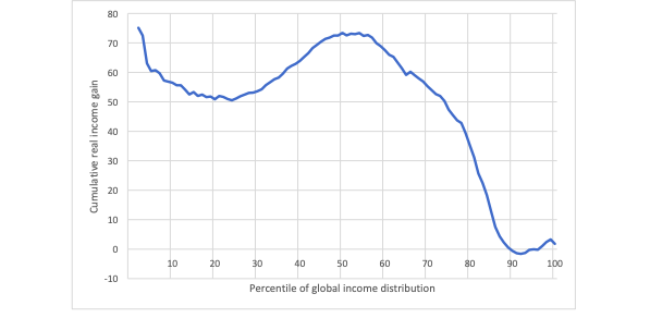
The ‘elephant graph‘ is a contender for the most important economic chart of the age.

It’s the work of the economists Branko Milanovic and Christoph Lakner. It shows income growth between 1988 and 2008 for every percentile of the world population — from the poorest 1% on the left-hand side to the richest 1% on the right. Join the dots and the resulting curve looks like an elephant.
Among the lowest income percentiles, there is very little income growth, but then just a bit further up the scale, there’s a steep increase in the growth rate — thus forming the hind quarters of the elephant. The bulk of the world’s population, roughly from the 10th to the 60th percentile, enjoyed the highest and fairly similar rates of income growth — thus forming the elephants back.
Next, the curve slopes up a bit further, but then begins to fall (the head of the elephant). After that, in the part of the chart corresponding to the developed world, the line plunges downwards (the forehead and trunk of the elephant). Finally, for the very richest percentiles, the line goes back up again — as if the end of the elephant’s trunk were curving upwards.
The elephant therefore describes the winners and losers of the global economy. In the developing world, the very poorest people in the world continued to do poorly, but most people in developing countries made real progress. The sudden downward slope corresponds to the working and middle class people in the West whose incomes stagnated. The upward curve at the end shows the richest people in the world getting even richer.
So, in one chart, the story of the neoliberal era: overall, the world got wealthier (and more equal), but there was growing inequality in the West.
The chart covers the twenty years from 1988 to 2008, which culminated in the near collapse of the global banking system and the Great Recession. What, then, happened next?
Branko Milanovic has just published the numbers for the 2008-2013 period. When distilled into a single chart the curve is roughly the same elephantine shape, except that the pachyderm has lost its trunk. Or, at least, it now has a very depressed-looking proboscis — drooping down without curving up again.

So, with the rate of income growth in developing countries greatly outstripping the developed world, the process of global convergence has continued. However, unlike the 1988-2008 period there was no runaway income growth for the very richest percentiles — i.e. inequality within the West didn’t get much worse.
But though the rich didn’t escape scot-free from the financial crisis, the impact has been cushioned for them. The banker bailouts followed by a decade of QE-fuelled asset inflation has softened the blow. Indeed, I wouldn’t be surprised if the next update of the elephant chart, covering the rest of the 2010s, shows the tip of the trunk perking up again.
Then there’s the question of what Covid-19 does to the elephant. One of the great ironies of the crisis is that China — that greater driver of global income convergence — has come out of it strongly so far. However, Milanovic is worried about the rest of the developing world:
Covid could yet break the elephant’s back.


Join the discussion
Join like minded readers that support our journalism by becoming a paid subscriber
To join the discussion in the comments, become a paid subscriber.
Join like minded readers that support our journalism, read unlimited articles and enjoy other subscriber-only benefits.
Subscribe