


Credit: Dan Kitwood/Getty Images


I’ve just travelled on the London Underground for the first time since lockdown. It was poignant to see the playful diamond-shaped superscript dot of the Johnston typeface being pressed into service on posters urging ‘social distancing’. Johnston, after all, is the most sociable of typefaces, being designed for universal legibility in crowded circumstances.
My footsteps echoed as I walked towards the ticket gates at Bank during what used to be the evening rush hour. I was the only person in that corridor, and when I passed through the ticket barrier, I noticed for the first time that the presentation of a valid Oyster card causes the word ‘Enter’ to flash up. It had a sinister connotation, as though Vincent Price were cackling in the background.
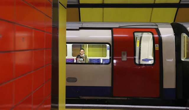
At the time of writing, ridership is a little over 10% of the normal figure, even though as many as 90% of the usual number of trains are operating at peak times. Whereas I hear “Wish the flipping pubs would open” all the time, I’ve never heard, “Can’t wait to get back on the Tube”. In the time of Covid-19, a trip on the Tube seems to be just what the doctor didn’t order, and the disease might have been designed to underline all those associations of the Tube with interment, the underworld and death.
When writing a history of the Underground, I discovered that Bank station was effectively built in the crypt of St Mary Woolnoth church, which still stands, looking slightly affronted at the proximity of the station. In The Wasteland, St Mary Woolnoth ‘kept the hours’ as the commuting crowd flowed on (‘I had not thought death had undone so many’).
In the first half of the 20th Century, avant-garde writers were much concerned with the Tube as a symbol of modernity. Most took a baleful view. In The Waves, Virginia Woolf wrote that, for one character, “descent into the Tube was like death. We were cut up, we were dissevered by all those faces and the hollow wind that seemed to roar down there like desert boulders.” And there was an imbalance, in that the writers more favourably disposed to the Tube tended to find it interesting rather than straightforwardly pleasurable. “I travelled by a tube train,” wrote F.T. Marinetti, the Futurist, in 1912, “I got what I wanted – not enjoyment, but a totally new idea of motion, of speed.”
I myself have always enjoyed the Tube, possibly because I have never had to commute. I subscribe to what might be described as the official line, which is that it is a beautiful, humane system, doing its best to mitigate the unnaturalness of the subterranean environment. This might also be described as the Frank Pick view, and my purpose in outlining it here is to commend it to anyone stuck with using the Tube right now.
Frank Pick was second-in-command of the Underground in the inter-war years. He was in charge of the aesthetics, to which he applied the principles of the Design Industries Association, which had evolved from those of the Arts and Crafts Movement, as set out by William Morris: elegant utility and fitness for purpose. In The Avant-Garde in Interwar England, Michael T. Saler contends that Frank Pick “dreamed of establishing Morris’s earthly paradise… the Underground would be a model of aesthetic integration and communal service, a catalyst for a more harmonious London of the future.”
Pick moved to London after growing up in York (as I did myself). According to Saler, he regarded London as “a hundred towns divided one against another”, whereas York was “the model for the integrated city life that Pick hoped could be re-established in all communities, especially London”.
By means of the Underground, Pick would make London a comprehensible as York, and to make the Underground comprehensible he commissioned Harry Beck’s diagrammatic Tube map. The above-mentioned Johnston typeface was another Pick commission. It adorned directional signs, sometimes illuminated (in light boxes) in the geometric, light-filled stations of Pick’s protégé architect, Charles Holden. Holden’s suburban masterpieces, such as Arnos Grove, Cockfosters, Tooting Bec, are open for business, and if they figure in your essential journey, consider: you are experiencing works of art at a time when all museums and galleries are closed.
Holden’s central London masterpiece is Piccadilly Circus. Oliver Green, the author of many good transport books (most recently London’s Underground) once suggested to me that Piccadilly Circus, with its seven pedestrian entrances from the street, ‘epitomises Frank Pick’s doctrine of passenger flow.’
The circular Piccadilly Circus ticket hall was conceived by Pick and Holden as a ‘concourse’ or ‘circulating area’ – new words when it opened in 1928. The station was overtly glamorous, like the people in the posters commissioned by Pick encouraging Londoners to make the most of their city. One poster proclaimed “The Playgoer Travels by Tube”. It shows a tail-coated waiter bowing to a couple in evening wear, and such attire was not incompatible with the mellow lighting in opal glass of Piccadilly Circus (which deliberately suggests a promising early evening), the use of brass, marble and expensive hardwoods, the cosmopolitanism implied by the World Clock, a map traversed by a mechanism showing the time anywhere in the world.
Last week, my journey from Bank took me to Piccadilly Circus. I was one of two passengers in the ticket hall and we were outnumbered by the four staff. It was like being in a ballroom before the ball; I half expected one of the staff to offer me a glass of champagne.
Not all of the glories of the Tube date from Pick’s time. If your journey involves the original parts of the Metropolitan Line (the world’s first underground railway, opened in 1863), look out for the steampunk fantasia of the stretch between King’s Cross and Farringdon, which lies in a cutting of towering arcaded walls, with the Fleet River carried in a giant pipe overhead. (If you crane your neck out of a carriage window you can just about see it.)
Or perhaps your habitual run is along the central parts of the Piccadilly or Bakerloo Lines, or the West End branch of the Northern Line. These are the Edwardian Yerkes Tubes, built by the American financier, Charles Tyson Yerkes, who gave London what are perhaps its most beautiful Tube stations, Holden’s work notwithstanding. (Holden’s Piccadilly Circus was a rebuilding of a Yerkes station.)
Yerkes’ architect, Leslie Green, created a different tile pattern for each station, so regular users would identify it as ‘home’, a place of their own. My favourite is Regent’s Park, which has the colours of a chocolate sundae: brown, cream mustard. I also like Covent Garden: white, yellow, orange, brown, with pale green art nouveau depictions of ticket windows. Both stations, being old, have lifts instead of escalators, so they are currently closed (because you can’t social distance in a lift), but you can appreciate the tiling as the trains roll past the deserted platforms.
The relative emptiness of the Tube also permits study of the moquettes, the carpet-like woollen material covering Tube seats. This is expensive to apply, and Londoners are lucky to have it. In most other cities you’d be sitting on stainless steel or plastic. You are gripped in your seat by the moquette’s pile (upstanding fibres) and like any sheep, moquette has thermal properties, being relatively cool in summer and warm in winter. Pick set high standard of moquette design, commissioning the likes of Paul Nash and Enid Marx. He favoured green, which he believed lent ‘a serene atmosphere’, being reminiscent of the countryside.
Those high standards are maintained by the principal suppliers of the moquette to the modern Tube, the high-end fabric designers Wallace-Sewell. Their smart blue and red Barman moquette — named after Frank Pick’s right-hand man, Christian Barman — is found on several lines and is highly popular, perhaps because it has a figurative element, incorporating pixelated images of London Bridge, the Eye, the dome of St Paul’s and Big Ben. Emma Sewell, originator of the design told me she was influenced there by Russian Constructivism, “the way a tractor, say, might be represented in those designs”.
A darker version of Barman, seeming to show the same landmarks at night, is on the Bakerloo Line, and the crepuscular mood suits those old trains, which date from 1973, and have a sort of faded grandeur.
Or perhaps your necessary journey takes you along the newest line: the Jubilee Line Extension, opened in 1999. Its stations were ‘future-proofed’. They’re big, in other words, particularly Canary Wharf, which is cathedral like, with massive ovoid concrete pillars lined at the base with stainless steel so they are not dirtied by people brushing past. (Fitness for purpose, you see.)
Even on the JLE, social distancing will not be possible if everyone who previously used the Tube returns to it. I suppose people will not return en masse until the virus has been somehow dispatched, or largely forgotten about, but not everyone will be back. The long-promised home-working revolution might finally be here, and London is currently full of wobbling tyro cyclists, some of whom will stick at it. The prospect of a less congested system is a piece of good news in difficult times, another reason to see the Underground bar and circle logo (championed and refined by Frank Pick) as suggesting a rising, rather than a setting, sun.
Andrew Martin’s latest book is Seats of London: a Field Guide to London Transport Moquette Patterns. His website is at https://jimstringernovels.
Join the discussion
Join like minded readers that support our journalism by becoming a paid subscriber
To join the discussion in the comments, become a paid subscriber.
Join like minded readers that support our journalism, read unlimited articles and enjoy other subscriber-only benefits.
Subscribe